 Responsive web design is the darling of the web design industry…but is it right for your next project?
By 2014 more than half of the web traffic will be delivered over a mobile device. If your website isn’t optimized for mobile, most of these visitors will bounce from your website like a quarter on a military cot.
If you talk to just about any web developer these days about developing a mobile website, they’re going to try and sell you on designing a responsive site. But what’s good for them might not be right for you.
If you’ve been considering a responsive website, read on…
What is responsive web design?
Responsive Web Design (RWD) is an approach to web design where the site is crafted to be optimally viewed regardless of screen size…no matter whether your visitor arrives by desktop, mobile device or tablet…now or any device in the future.
Remember when they told us that CDs wouldn’t scratch? 😉
And while RWD offers a lot of potential benefits, the idea that it’s right for all web projects is ludicrous.
There’s no one calling plan, diet or religion that’s right for everyone, so why do we believe that there’s a one-size-fits-all approach to redesigning your website?
Below are five reasons why responsive design is wrong for your next project.
1. “Mobile First” is just bone headed advice.
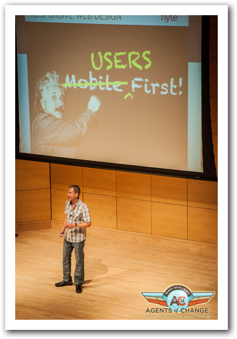 “Mobile First” is the rallying call of responsive web designers, meaning that you design first for mobile, then for other platforms.
While that’s seemingly harmless advice, the truth is that we should be designing for Users First.
For years I’ve been telling businesses that although you want to write search engine optimized content, Google is never going to be your customer. You need to write for your ideal customer, then make sure that your copy can be understood by the search engines.
The same is true with mobile web design: design first for the user, then for the platform. Just keep in mind that someone on a mobile device may have different needs (i.e., directions or a phone number), than the same person when she’s on a desktop computer (such as deeper resources.)
2. Responsive Design often means unnecessarily long load times for mobile users.
RWD means that you’re delivering all the same content regardless of the platform, just optimized for the viewing screen.
However, there may be plenty of content on your site that doesn’t need to be shown to mobile users. However, it’s going to be automatically downloaded–often in areas with poor cell reception–as your visitor accesses your site.
Long content pages with one (or even two) side columns that work well on the desktop, are finger-cramping scrolling exercises on the thin single-column of the phone, creating a painful mobile experience.
Images–optimized for desktop screens–are also a problem. As Juan Pable Sarmiento says:
In responsive web design this is the most problematic matter because resizing a desktop image to fit a mobile device’s screen implies downloading an image that’s been suited for a desktop environment. To view full images on a mobile device you need to download an unnecessary large file and resizing it to fit the screen.
3. There’s no “Desktop View.”
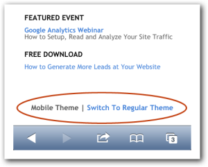 On most non-responsive mobile websites there’s an option at the bottom of the page: View in Desktop Mode, or something similar. This allows the viewer to override the mobile style sheets and see the site as it was designed for a desktop computer.
In the world of RWD, there’s an arrogant belief that we know what’s best for the user. That if the designer has done his or her job, there’s no need for a desktop view.
However, as we transition into this brave new world of mobile, many people still prefer the traditional desktop design. This is especially true for sites that get a lot of repeat traffic. When someone has become comfortable with your desktop design, why make them learn a new interface? Why not give them the option of the desktop view?
Again, RWD’s “one size adjusts to all” can feel paternalistic.
4. You have a perfectly good website.
 If you’ve got a perfectly good website–meaning it’s attracting visitors, generating leads and building your business–then converting to a responsive website will most likely require you to rebuild from scratch.
Remember: “mobile first.”
In cases where your website is already performing well, there may be better options. One would be to create a mobile-specific website (which admittedly has its own shortcomings), so that you could keep your current site “as is”, and just redirect mobile users to a mobile-specific site.
If you’re on WordPress, (one out of six websites in the world are built on the popular CMS), you could install the WP-Touch plugin. The flyte new media site uses this plugin to deliver a mobile-friendly experience.
The plugin is free and takes moments to install. As a designer, I’m not crazy about the out-of-the-box design, but you can work with your web designer to create a more attractive, branded theme as we did.
And now, with WP-Touch Pro, you can create tablet-specific experiences as well.
We were able to create a great experience for our mobile users at a fraction of the cost of redesigning the site to be responsive.
5. You’re not getting a lot of mobile traffic.
There’s no guarantee that by 2014 you’ll be getting more than half of your traffic from mobile devices.
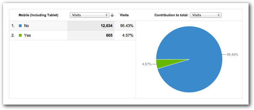
Certain industries, especial in hospitality, shopping and news, are likely to see big increases in mobile traffic. However, other industries will have more time to adjust.
The only way to know for sure is to look at your Google Analytics and see what percentage of traffic to your site is on a mobile device, and at what speed that’s increasing.
I’m not suggesting you should bury your head in the sand! Rather, that you should make the business decisions that make the most sense for your business…not your web developer’s.
Yes, I believe your mobile traffic will continue to increase as a percentage of your overall traffic and you’re making a critical mistake if you wait too long to adapt. However, if you’re not planning on a website overhaul this year, it might make more sense to find a stopgap measure and use your marketing budget for something else.
Think I’m alone in my thinking? Here are a few who agree that responsive “ain’t all that.”
- 11 Reasons Why Responsive Web Design Isn’t That Cool – Juan Pablo Sarmiento, Web Design Shock
- 5 Reasons Why Responsive Design Is Not Worth It – Tom Ewer, ManageWP
- Responsive Design Makes It Hard to Be Fast – Guy Podjarny, Guy’s Pod
Conclusions and Caveats
As some of you may have realized, The Marketing Agents is responsive.
Oh, the horror!
I’m not suggesting that RWD isn’t a good choice in many situations, but saying it’s the right choice for everyone is like suggesting that everyone should drive a Prius because of the gas mileage. Try selling that to a general contractor working on a construction site or a mom who’s driving soccer practice carpool for six kids.
As time goes on and designers get more experience with RWD–understanding the shortcomings and discovering the workarounds–they’ll be able to develop better experiences for the end user AND the business owner.
But for now, know that there’s more than one way to build a mobile website.
If you know someone who’s been thinking about getting a mobile site built, or someone who thinks responsive web design is the greatest thing since sliced onions for colds, please share this post with them.
And, if you think I’m out of my tree on this one, let me have it in the comments below.